You are early. Your numbers are small. That’s okay. What matters is how you tell the story behind them. Good framing turns tiny signals into clear proof. It shows that people get value fast, come back on their own, and move toward paid steps. With the right words and clean charts, your deck can feel strong, calm, and real—even at pre-seed.
This guide teaches you how to pick the right metrics, set simple definitions, show honest trends, and link each number to one change you shipped. We’ll keep it plain and tactical so you can update your deck in a day. If you want help turning your core loop into protected IP while you polish your story, Tran.vc invests up to $50,000 in in-kind patent and IP services for AI, robotics, and deep tech teams.
Choose the Few Signals That Carry Your Story

Your deck does not need many numbers. It needs a few that prove value, speed, and control. When you choose with care, each chart has a job and does it well. The room feels calm because your story is simple and true.
Pick one job to anchor every metric
Start by naming the job your product does in one short line. It might be “catch defects on line two” or “turn messy notes into a clean spec.” Keep this line at the top of your metrics doc and mirror it on each slide. When the job is clear, every metric points to it, which makes your story feel tight.
Check each number against the job. If a metric does not show progress on that job, drop it. Vanity counts, like “page views,” create noise. Real counts, like “first defect flagged,” create trust. You are early, so you win by staying close to the work.
Share the job line with your team before you design slides. Engineers, designers, and sales should all use the same words. This small habit stops debate in meetings and speeds choices. Alignment is a signal by itself.
Write one-line definitions you can say out loud
Define activation, active use, and qualified pipeline in plain words. Write them as full sentences, not jargon. “Activation is the first flagged defect on a real part” is strong. “Active means a new run with a saved preset” is strong. Simple words reduce doubt.
Put each definition in tiny type at the top corner of its slide. Rooms relax when terms are clear. If a partner asks “what does active mean,” you point to the line and keep moving. You look prepared because you are.
Keep a change log for definitions. If you shift your activation event as you learn, show the date and reason in a footnote. Honest change builds trust. Quiet change breaks it.
Set honest time windows that match your product
Daily tools can show day-seven and day-thirty. Heavy systems may need week-four and week-eight, or even month-one and month-two. Choose the window your buyer would expect in the real world.
Say the window on the slide. “Activation within seven days” or “Account active in week four.” Context matters. A smaller honest number beats a bigger fuzzy one because it feels real.
Review windows once a quarter, not every week. Stability lets trends appear. Trends, not single points, are what partners believe. If you want help aligning windows with a clear IP plan, Tran.vc can work with you. Apply at https://www.tran.vc/apply-now-form/.
Build an Activation Slide That Earns Trust
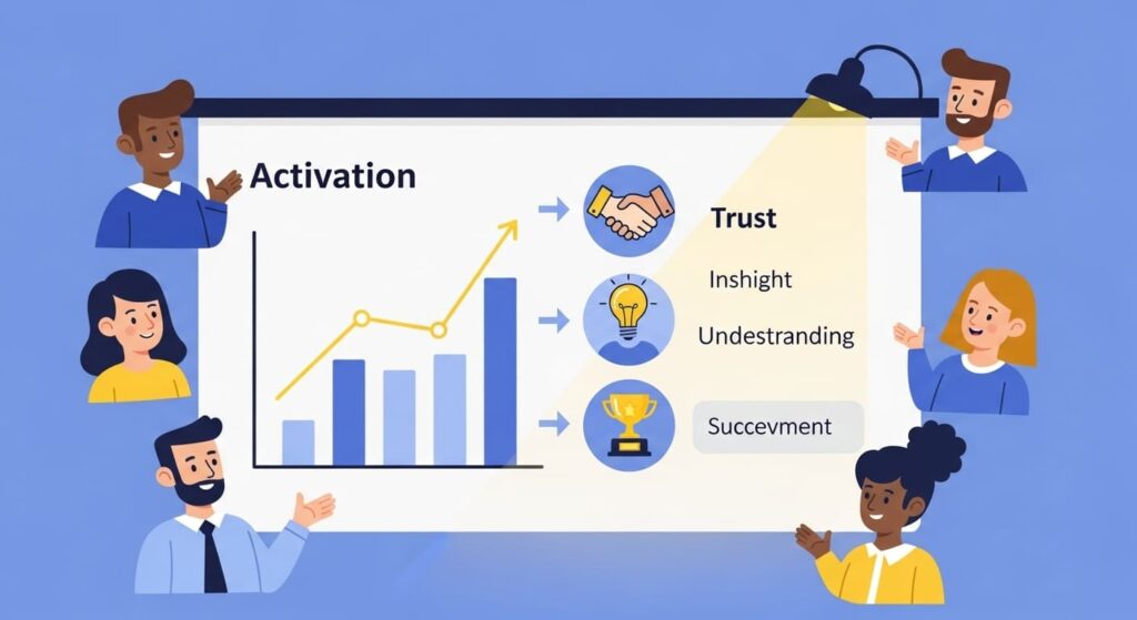
Activation is the first true win. Show it right and the room will see value land fast. You are not bragging. You are proving that strangers reach a result without hand-holding.
Define the first win so no one argues
Tie the win to the job, not a click. A login is not a win. A tour is not a win. A first flagged defect, a safe robot move, or a clean spec is a win. Write it in one sentence at the top of the slide.
Show one small screenshot of that win. Redact what you must. A real screen says more than a big headline. It makes the number feel like a moment that happened, not an idea you like.
If your product needs setup, add a quiet note that says what was preloaded. “Ran with default glare preset.” This honesty keeps you in good standing when diligence starts.
Show rate and time, side by side
Place two big numbers: percent of new users who hit the win and median time to win. The pair tells speed and reach. A 42% rate in one day is a better story than a 60% rate in two weeks if the job demands speed.
Under the numbers, show a small weekly line for the last eight to ten weeks. Keep the line simple. No grid, no colors, just a slope. The small climb proves you can improve the engine, not just the headline.
Add one line about the cohort window. “Cohorts are new signups each week; window seven days.” This keeps the slide self-contained. A partner can read it without you in the room.
Explain the lift with one cause, one date
Pick the change that moved the number. Name it in five to seven words. “Added dry run before live run.” Put a date next to it. Dates build trust because they anchor talk to time.
Say what behavior changed. “More users completed first run without support.” Keep it plain. You are teaching the room how you learn. People invest in teams that learn.
Close the slide with one next move you will ship. “Next: preload last good settings.” When you send your update with the new dot on the same chart, your stock rises. If you want help turning these fixes into claims you own, Tran.vc invests up to $50,000 in in-kind IP work. Apply at https://www.tran.vc/apply-now-form/.
Build a Retention Slide That Shows Habit

Retention is quiet proof. It says users return on their own. A clean retention slide calms the room because habits mean base revenue later, even if you do not have it yet.
Choose an “active” event tied to the job
Active should be a repeat of the core task, not a login. “Second flagged defect on a live run” or “new spec exported and shared” are strong. This keeps you honest and keeps the number useful.
State the active event in one line at the top corner of the slide. Reuse the same words in your product and support playbooks. When the whole company uses the same language, your numbers stop drifting.
If you sell by account, also define account active in behavior terms. “Any technician completed a new safe run this week.” Billing is lagging truth at pre-seed. Behavior is current truth.
Plot cohorts with a flat tail you can raise
Show a cohort curve for users and, if useful, for accounts. The eye should see the first drop and the flat tail. Label the tail value. “Tail ~31% at week eight.” This number is the heart of your habit story.
Add two small date labels above points where the line improved. “Kept presets,” “fewer false rejects.” Short labels tell the cause. Labels make the line feel earned, not lucky.
Do not pack many cohorts on one slide. One or two clear lines beat a rainbow. The goal is reading, not art. If a partner wants more, you can show an appendix later.
Segment once to prove fit, not twice to confuse
Pick the segment that matters. Role, use case, or channel. Show the curve for that segment beside the overall curve. When the “right” users retain higher, you look focused, not narrow.
Explain why the segment retains. “Line leads return because dry run removes fear on shift.” This line tells the human truth behind the number. Human truth sticks.
End with one next move to lift the tail. “Auto-save last good settings.” Promise small, then deliver fast. If that move comes from a unique method, capture it and consider filing. A protected loop keeps your tail high as you scale.
Show Early Dollars Without Hype

You may not have big revenue yet. You can still show speed to dollars. Time to first revenue is a clean, early sign that your pitch turns into a PO. A simple slide here moves rooms.
Define start and stop the same way every time
Start the clock on the first qualified call. Qualified means the buyer has the pain, the power, and a path to pay. Do not start on a cold reply. Do not start on a demo for a student. Be strict.
Stop the clock on money received. A signature is not cash. Cash is cash. If the first step is a small pilot fee, that counts. Money is the proof that a promise became a plan.
Write both rules on the slide in tiny type. Rules are your shield. When someone asks “how do you count this,” you can answer once and move on.
Show the median and what you fixed
Plot the median days to first revenue by month or quarter. The median is stronger than the average at this stage because a few long deals can skew the mean. You want the typical case.
Label two points where you sped up. “One-page pilot order,” “security FAQ published.” These small moves often cut a week or more. They also show you respect the buyer’s process, which lowers risk for them.
Add one short story in the notes: “Old path: 74 days, heavy legal. New path: 31 days with guarded scope.” Stories make the line real. Save details for diligence.
Offer a tiny paid step that matches your wedge
Close the slide with the exact step you sell today. “Two-week guarded pilot on line two, one scene, one metric.” Name the guardrail. Name the owner. Name the date you can start.
This line turns a chart into a plan. In the room, people will nod because they can picture the first move. Nods lead to checks.
If the reason you move fast is a method others lack—say, a setup preset or a safety loop—capture it and consider filing. Speed that cannot be copied is a moat. Tran.vc can help you protect it while you scale.
Show Burn Discipline Without Killing Momentum
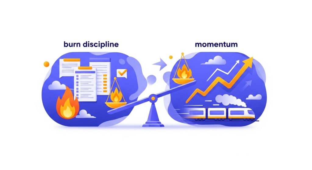
Investors want to see that each dollar you spend turns into lasting progress. You can show this with a simple burn story. Keep it clean. Keep it tied to net new results. Make it clear that you cut waste, not growth.
Define burn multiple in one line
Say what you mean in plain words. “Burn multiple is cash burned this quarter divided by net new revenue this quarter.” If you sell pilots, use cash collected. If you sell subscriptions, use net new MRR. Pick one and stick with it.
Put the rule in tiny type on the slide. This stops side debates before they start. It also makes follow-up easy because anyone can check your math later with the same rule.
If you are very early and revenue is tiny, show “burn per activation” as a starter. “Cash burned divided by number of users who reached the first win.” This keeps focus on real value, not clicks.
Show the last three periods, not a lifetime average
Plot three dots: the last three months or quarters. Add a small line through them. This shows direction without hiding noise. Rooms trust short, recent views more than long, smoothed charts.
Place two short labels above dots where you changed something real. “Paused cold ads,” “one-page pilot order.” Tiny actions that cut burn or raised net new revenue are better than broad claims.
Add one sentence under the chart: “Spend flat, net new up → burn multiple fell from 3.1× to 1.7×.” Simple, causal, dated. It reads like control.
Explain how you will lower it again
Name one lever you will pull next. “Move setup to presets to lift paid conversion.” Promise a near-term target. “Aim 1.4× next quarter.” Small, close goals feel real.
Tie the lever to a user outcome, not a budget cut. “Fewer support hours because dry run removes fear.” This says you win by product, not by starving growth.
If the lever is a unique method that trims setup or support, say you filed. “Preset pipeline (provisional filed).” Protected efficiency is a moat. Tran.vc can help choose and file claims while you ship. Apply at https://www.tran.vc/apply-now-form/.
Prove Pipeline Quality Before Big Revenue

A tight pipeline slide shows tomorrow’s dollars without hype. You are not waving a long list. You are showing a short list that can move now. It calms rooms because it feels like a plan, not a wish.
Define “qualified” so anyone can score a deal
Use one clear rule: “Buyer with the problem, path to budget, next step booked.” If any part is missing, it is not qualified. Hard lines make strong slides.
Write the rule on the slide in tiny type. Then show only deals that meet it. Color by stage if you must, but keep the list short and true.
Re-score weekly. Move stale deals out. New ones in. The act of pruning is a signal. It says you respect time and have standards.
Show stage speed and next steps
Add one small table: Company, Stage, Close Month, Amount. Keep it readable. Put a date on each next step. Dates create gravity.
Include one line chart of “days per stage” for the last five wins. Mark the fix that sped things up. “Security FAQ cut two weeks.” Time saved is the loudest non-revenue proof you have.
Close with one sentence on where friction lives now and what you will ship to reduce it. You are guiding the funnel, not watching it.
Link each deal to a proof asset
Attach one artifact per deal: sandbox clip, shadow score, benchmark page, or safety case. Put the asset name in the table. “Glare-03 clip,” “Shadow Pair 17.”
Shared assets cut internal debates on the buyer side. Your champion forwards files, not claims. That shortens cycles without spend.
When one asset wins across sites, protect the method it proves. That turns repeatable proof into a moat you own. Tran.vc helps founders do this as part of our in-kind IP work.
Design Metrics Slides People Can Read in 8 Seconds

Pretty slides do not win rounds. Clear slides do. Your goal is fast comprehension. One big number, one small chart, one short note. White space is your friend. Jargon is not.
Use big, honest numbers up top
Make the headline number huge and legible. “Activation 48%,” “Median time to first revenue 31 days,” “Week-8 tail 34%.” Big type signals confidence and helps the room keep pace.
Place the definition in tiny type right above or below the number. Now the reader knows exactly what the number means without asking.
Avoid decimals unless they matter. Round to whole numbers. Signal trends with your chart, not with fussy precision that breeds doubt.
Let one chart show motion, not decoration
Pick the right simple chart: a line for trends, a cohort curve for retention, three dots for burn multiple, a tiny bar for stage speed. Keep axes clean. No grid. No 3D.
Label only the moments you changed something. “Added dry run,” “Kept presets,” “Pilot order shipped.” Labels make cause-and-effect obvious.
Use one color across the deck. Black or dark gray is enough. Color noise kills focus and makes numbers look like marketing, not truth.
Write one sentence that says “so what”
Under each chart, add one short line in plain words. “Faster first win lifted week-4 return.” “Guardrail reduced false rejects; tail rose.” “Security FAQ cut legal time; PO moved sooner.”
This is the voiceover for anyone reading without you. It turns a picture into a point.
End each slide with “Next →” and one action. The room now sees motion. Motion plus clarity earns follow-up.
Handle Weak Numbers with Calm Honesty
Not every number will sing. That’s okay. What matters is how you explain it and what you are doing next. Rooms reward clarity and action over polish.
Own the gap in one sentence
Say the number. Say why it is low. Keep it specific. “Activation dipped after we moved import; users got stuck on file format.” Specifics sound like truth.
Avoid defensive words. No “but” chains. One cause, plainly stated, reads like leadership.
Add the date you saw the dip. Dates say you watch your own work and respond fast.
Show the fix and early signs
Describe the change you shipped to address the gap. “Added sample set and auto-detect.” Show the first cohort after the fix, even if it is small.
If it is too early for a new point, show a process metric moving in the right direction. “Support tickets on import fell from 19 to 6.” Process can be a leading signal.
Put a timer on when the main metric should reflect the fix. “Expect impact in two cohorts.” Then follow up with the new dot. Loop closed.
Segment to reveal the true fit
If the overall looks weak but your wedge is strong, show both. “Overall 28% vs. line-2 managers 52%.” Fit lives in the wedge.
Explain why the wedge retains better, in human terms. “Shift leads trust dry run; they act daily.” People remember human reasons.
Commit to focus on the wedge for the next sprint. Focus reads like discipline, not avoidance.
Tie Metrics to Moat Without Sounding Like a Lawyer

Your best numbers usually come from a method you invented. Name it in simple steps. File it early. Mention it lightly on the slide. Now traction and moat move together.
Find the method behind the lift
Ask which step made the metric jump. A data recipe? A planner under glare? A confidence score that blends sensors? Write the steps as inputs → transforms → checks → fallbacks.
Keep the steps in plain words first. If the team nods, you found the engine. If they argue, keep digging. Engines are obvious once named.
Confirm with logs. Show before/after behavior tied to that step. Evidence turns hunch into asset.
File fast, then refine with use
Draft a focused provisional around the engine and the key variants you tested. Use field context in the spec: speeds, light, device types. Utility plus novelty is the test; field context proves utility.
As you deploy, collect more clips and logs. Add them to a continuation or a PCT later. Filing early starts your clock and protects the core while you learn.
Tran.vc works side by side on this. We invest up to $50,000 in in-kind patent work to turn metric-moving methods into claims that stick.
Place a quiet note on the slide
Add “Method: glare-safe planner (provisional filed)” as a small footer where relevant. No bold. No legalese. Just a calm tag that links lift to moat.
Use the same phrasing across slides. Repetition helps partners retell your story in their meeting.
Keep backup in the appendix: a one-page method flow and one field clip. If asked, you flip and answer in seconds.
Finish with a Two-Slide Summary Anyone Can Carry
People forward short decks. Make yours easy to retell. Two slides can cover the proof and the plan. Keep the frame steady and swap in fresh dots as you grow.
Slide A: Proof that value lands fast and sticks
Top row: big numbers—Activation %, Median time to win, Week-8 tail. Small definitions in the corner.
Middle: two mini charts—activation trend with one label; cohort curve with two labels.
Bottom: one operator quote in raw words, plus a quiet method note if filed. The eye learns the pattern in seconds.
Slide B: Motion and near-term dollars
Left: three dated release notes with the metric each moved. Right: qualified pipeline table—Company, Stage, Close Month, Amount. Footer: “Pipeline ÷ Goal = 2.4×.”
Tiny line: median days to first revenue with one label (“one-page pilot order”).
CTA bar: “Two-week guarded pilot, one scene, owners named.” A clear door to a yes.
Keep the appendix ready, not heavy
Append clips, bundles, safety page, integration notes, and the one-pager on your provisional. Name files so they can be found later.
In Q&A, answer with assets, not talk. Each flip earns trust and shortens the road to a check.
Update monthly. The frame stays. The dots and deals refresh. Your story always matches the latest truth.
Show Confidence and Error Bars Without Scaring the Room

Some numbers wobble. That’s normal at pre-seed. Good framing shows strength and limits at the same time. You can do this with simple confidence cues that fit on a slide and make your story feel honest.
Use ranges, not guesses
When a metric is noisy, show a range band instead of a single point. A thin, light band around your line tells the room, “we measured, here’s the spread.” Keep the band narrow in look, even if the range is wide; label the upper and lower edge so no one misreads it.
Explain, in one line, how you built the range. “Band = 25th–75th percentile across last 8 weekly cohorts.” Plain math beats vague words. People relax when they see the rule.
If the band is huge, do not hide it. Pair it with the one fix you are shipping to shrink it next cohort. “Preset reduces variance from cold starts.” Then show the new dot in your next update.
Add confidence badges to claims
Next to each headline number, place a small badge—High, Medium, or Early—with a one-line reason. “High: 600 sessions, same window.” “Early: 12 pilots, mixed roles.” This sets the tone and saves five minutes of back-and-forth.
Use the same badge style on every slide. Consistency builds trust. If all badges say High, people will doubt you. If all say Early, you will undersell. Mix them based on truth.
Upgrade badges only with new data, not vibes. When you move Early → Medium, note the date and the dataset size that unlocked the change. It reads like science, not spin.
Show error by cause, not just total
Group misses by cause: glare, drift, occlusion, bad labels. A small stacked bar with simple labels teaches fast. It also points to clear fixes.
Add one line under the bar: “Glare down after dry run; drift next.” This tells the room you have a plan that maps to the shape of error, not a random list.
If a cause vanishes after a change, circle it and date it. Then reuse that chart in sales. Buyers care about causes they live with each day. When your line drops on their pain, you win time and trust.
Craft a “Weakness Slide” Before They Ask
Strong founders surface gaps first. A clean weakness slide turns a tough question into a calm answer. It also frames risk as a short list you already work on.
List three gaps with owner and date
Write each gap in one short line, no fluff. “Activation dips on cold imports.” “Legal adds 14 days.” “Low confidence on shiny parts.” Add an owner and a date for the planned fix.
Keep the list to three. More looks messy. Fewer looks evasive. Three says you can see, sort, and act.
Place this slide after your core metrics. You’ve earned the right to be blunt because you already showed proof. The contrast reads as maturity.
Tie each gap to one metric you track
Next to each gap, show the metric the fix will move. “Dips → activation rate.” “Legal → days to first revenue.” “Shiny parts → cohort tail.” This link proves you don’t chase chores; you move numbers.
State how you’ll see the lift in one window. “Expect +8–12 pts in two cohorts.” Now the room can picture your next update.
If you’ve shipped the fix but it’s early, show a process proxy. “Import tickets fell from 19 to 6.” It is honest and points the right way.
Turn a gap into moat when you can
If a fix is a novel method—say, a glare-safe planner—note “provisional filed” in small type. A weakness that became IP is a rare and powerful story.
Do not force it. Some gaps are pure process. That’s fine. Own them and show progress.
When a method moves the needle twice, promote it from fix to core engine in your deck. Engines deserve their own slide—and their own claim.
Make a One-Page Metrics Methodology Appendix

You will get questions on how you count. A short, readable appendix saves time and builds trust. It also keeps your team aligned when the deck travels.
Keep it to four blocks
Block 1: Definitions (activation, active, qualified pipeline). Block 2: Windows (7-day, 30-day, monthly). Block 3: Cohort rules (who’s in, who’s out). Block 4: Data sources (what logs, what external).
Write each block in two or three short lines. No dense tables. The goal is fast understanding, not a textbook.
Add a small change log at the bottom with dates. “2025-01-10: activation switched to ‘first live defect’ from ‘dry run.’” This kills confusion later.
Show one sample cohort table
Include a tiny anonymized table: user_id, signup_week, hit_activation (Y/N), time_to_win, active_week4 (Y/N). Real rows beat diagrams because they show the grain of your data.
Circle the fields you use on your slides. People see exactly how numbers are built. The mystery fades.
Offer the same sample in CSV in your data room. Diligence teams will thank you. You will save a week of back-and-forth.
Name limits and guardrails
State what you do not track and why. “We do not log raw images; we log bounding boxes and timestamps.” This answers privacy and security in one breath.
Note how you handle outliers. “Trim top/bottom 1% for time_to_win.” Simple rules prevent “chart shopping.”
If you created a lighter-weight method to get the same insight with less data, say so. That can be protectable. Tran.vc can help you file claims around privacy-preserving measurement while keeping your loop fast.
Build a Post-Pitch Update Rhythm That Compounds
The meeting is not the end. The update is the start. A steady, useful update turns “maybe later” into “keep me posted,” and then into “let’s remeet.”
Send a one-screen update in 14 days
Use the same three slides you pitched—activation, retention, time to first revenue—and paste new dots with the same definitions. Familiar frames make changes pop.
Add one line: “Shipped X on 2025-01-12; activation +9 pts; median time −18 min.” Dates and deltas do the work.
Close with one crisp ask tied to your wedge. “Two lines running mixed gloss for a guarded pilot.” Specific asks unlock specific intros.
Keep a public proof shelf
Host short clips: one sandbox run, one shadow pair, one safety page. Keep file names stable so forwarders can find them.
Swap in fresher proof each month, but keep the frame. Repetition helps partners retell your story without you.
If a method changed the curve, add “provisional filed” to the clip caption. Quiet, strong, and easy to recall.
Graduate readers from “interested” to “in”
Track who opens and replies. When someone clicks the same asset twice, offer a ten-minute check-in with one new proof tailored to their theme.
Bring a tiny next step to that call: a two-week guarded run with owners and dates. Remove choices. Make “yes” easy.
When they pass, ask for one intro to a look-alike account. Give them the exact one-liner to forward. Many will help when the work is clear.
Add a Small “Metrics to IP” Bridge Slide

Most decks keep traction and moat apart. Bridge them. A tiny slide that links lifts to methods—and methods to filings—tells a bigger story with very few words.
Map lifts → methods in one table
Three rows. Column A: metric shift (“Activation +11 pts”). Column B: method (“Dry run + glare preset”). Column C: status (“Provisional filed 2025-01-15”).
This shows cause, craft, and control at once. Investors can carry this in a partner meeting without you.
Keep methods in simple language. Inputs → checks → fallbacks. Save claims text for counsel.
Keep proofs one click away
Each row links to a 20-second clip or a screenshot with a timestamp. No music. No edits. Just the moment.
Also link to the one-page method sketch. Flow, not code. Clear steps make novelty easy to see.
In diligence, these two files answer 80% of questions fast. Speed is a signal by itself.
Refresh as dots move
When a new method moves a metric, add a row. When a filing advances, update status. The slide becomes a living index of your edge.
Retire rows that no longer matter. A lean slide reads stronger than a trophy case.
Tran.vc helps you choose what belongs and does the filings alongside you—up to $50,000 in in-kind IP work—so this bridge is real, not wishful.
Conclusion: Turn Small Numbers into Clear Proof
Your metrics do not need to be big. They need to be true, clean, and tied to the job. Define each metric in one line, show motion with one simple chart, and name one change that caused it. Add a date. Add a screen. Keep the voice calm. When a deck reads this way, partners feel control. They see value land fast, habit form, and dollars come closer each week. That is enough at pre-seed.
Keep the loop tight after the meeting. Ship the next small fix. Send a short update with the new dot on the same chart and the same definition. Repeat. When a unique method makes the dot move—preset, guardrail, data recipe—write the steps and file. Now your best numbers rest on assets you own. Traction plus moat beats loud growth with no base.
If you want help making this real, Tran.vc invests up to $50,000 in in-kind patent and IP services for AI, robotics, and deep tech teams. We help you choose the right metrics, file around the engine that moves them, and present a deck that reads like steady proof. Apply anytime at https://www.tran.vc/apply-now-form/.